Tuesday, September 18, 2012

Sleepless in Adobe

Can't sleep tonight, so of course I get on my computer and keep on playing with the 3D "M" that I made earlier on Adobe Illustrator.

What else would designers do at 4 am?

Someday I'll wake up and I'll be Paul Rand, and it'll all be worth it.


Monday, September 17, 2012

Swinging

Just doing what designers do—that is, saying awkward innuendos that are also completely nerdy: In this case, the phrase actually makes sense, and honestly, anyone that can switch cleanly from RGB to CMYK and back during printing or processing is a friend of mine.


First roughs at logotype and personal identity branding


So here's my favorite idea so far in my Corporate Branding class for creating a visual identity for myself. 

Personally, I think it's brilliant...but then I think that most of the work that I make is brilliant (and it usually isn't). 

But I do love working with the fact that "Matthew" is one of the most common names in the United States, and so instead of trying to weave my name through some blithe, forgettable typeface, I thought instead to brand myself without the M, creating "Atthew Design." It's memorable, breaks tradition and traditional logic (and in those respects it's both familiar AND surprising), is playful, and facilitates a triangulating interaction between viewer, brand name, and logotype for interpretation. 


I'm praying that my teacher, Eric, will love the idea as much as I do. 


Also, nobody email the phony address that I put on the business card mock-up. 


front and back of prospective "Atthew Design" business cards


Saturday, July 28, 2012

Chekhov Poster: Three Sisters

My lastest poster trials, this time for Three Sisters. Unlike The Cherry Orchard poster that I'm doing, this one is openly in the Saul Bass poster style of the 60's. 

The images that I kept wanting to use were the three sisters themselves, and the scene of the house burning. And then I realized...USE BOTH OF THE IMAGES (their hair doubles as flames in the poster. ta-da.)
I also wanted a sense of claustrophobia and even madness to the image, which I also feel like it properly conveys. 


Thursday, July 26, 2012

Sketchbook

A few pages of some of the work I've been doing. 
Red pens and red colored pencils have been my best friends this past week. 


Self Portrait

Another self-portrait in oils. Rembrandt-inspired. 
Alla-prima, from life, with:
Ivory Black
Titanium White
Burnt Sienna
Yellow Ochre 


Also, I'm kind of in love with my own brushwork. I literally zoom in all the way in Photoshop and just look at it. 


Monday, July 23, 2012

Poster Comps: The Cherry Orchard, Anton Chekhov

First run-throughs for my Anton Chekhov poster series.

#1: The Cherry Orchard

My concept deals with counterpointing nostalgia with darkness and grittiness. I wanted the poster to look like a paper cutout illustration circo 1960 / 70. Even though the play "takes place" at the turn of the 1900's, I feel like 60's and 70's imagery is more nostalgic for modern audiences.


And for your viewing pleasure, here's how I go about it.


1-A way-too-fast, half-assed sketch


2-Me spending a bajillion hours trying to make shapes from my sketch using the pen tool in Adobe Illustrator


3-And finally a few ideas that are still FAR from being done, but probably one of these will probably end up being the final. As you can see, I'm moving away from the centered-saw composition in light of something a bit more dynamic.


UPDATES TO COME. 


Tuesday, July 17, 2012

Oh look what I found.

So, I just found this really old book cover comp that I made a few months ago for David Foster Wallace's A Supposedly Fun Thing I'll Never Do Again. It's a phenomenal collection of that man's essays. Think of it like David Sedaris but much more cynical, more cerebral, and lots lots LOTS more footnotes.

This is a screenshot which is why the type looks so screwy. I promise you that I use normal typefaces.

I still really like this approach, and I'll probably be coming back to this sometime in the future.


Thursday, July 5, 2012

magic


Chekhov Cards

Russian Lit assignment. First experiments.

*Also, I can't be sure of any of the Russian text. I just do as translate.google.com tells me. 


I wanted something extremely simple, but at the same time potent and modern. The short story tells the tale of a hallucinating, megalomaniac named Andrey Vassilitch Korvin who is having visions of a black monk, who tells him that he is chosen by God to lead humanity into a brighter future. The majority of the story takes place at his soon-to-be-father-in-law's gardens and orchards: trees and fruits about which the old man obsesses to the point of neurosis. Like many of Chekhov's characters, Korvin becomes disillusioned, miserable, divorced, more miserable, catches tuberculosis, and then dies. Also his father-in-law dies. 

Honestly though, the story is pretty incredible—in fact, you can read the whole splendid thing here

The upside-down growing apple, or the cut, hanging pear both play with formalistic and naturalistic imagery in unnatural states, which I believe properly describes the whole timbre of the story without being vulgarly literal, plus I just love that cut pear with its weird asymmetry and that dark seed pushing out of it.  

Monday, June 25, 2012

Work Work.

So. I have the privilege and opportunity to be working as a design and production intern here at Nu Skin in Provo, in this lovely building.


Other than the usual, menial production jobs that us intern gets, sometimes we get the opportunity to do something really cool and interesting.

Currently, the other intern and I are working on creating fairly holistic campaign centered around the introduction of an improved employee and managerial interface/interaction system. We will be creating a separate, sub-brand identity (a unique one that still functions beneath the Nu Skin aesthetic), and be creating a series of miniature advertising posters, a larger posters, and possibly stationary and web elements as well. 

Although these are just the first takes at it, this the general direction that we were taking it in.

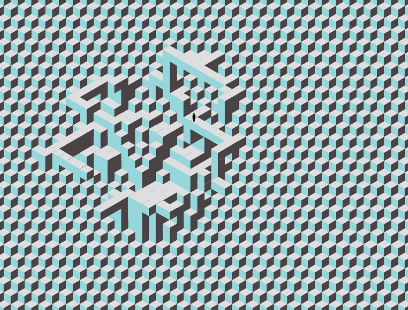
We were inspired by the concept of a simplification and interface-redesign of an older, confusing, less efficient system; we wanted to create something that was pictorial, memorable, and to some degree narrational. The idea is that Nu Skin is taking these chaotic, unstable shapes and reducing and reinventing them to become stable, efficient geometric forms. The forms on black, as well as the selection of CMYK pantones is meant to invoke a sort of technological formalism. '

Chances are that we'll have to change a bunch of stuff to it. In fact the final version may end up looking nothing like this. It's just that the other intern and I are just too in love with the idea of it, which means that it's destined to be slaughtered by higher authorities. It always happens. C'est la vie.


Recent Illustrations

Inspired by my older sister's role as Little Red Riding Hood in the Utah Valley Princess Festival, I decided to start playing around with images of wolves (which, unfortunately are a sickeningly stereotypical hipster trope. Blech). However, I liked the idea of the simple face and texture combo, creating (hopefully) a properly nightmarish massiveness. 


I was also drawn to this wonderfully positive quote by Anton Chekhov: 


"When a person is born, he can embark on only one of three roads of life: if you go right, the wolves will eat you; if you go left, you’ll eat the wolves; if you go straight, you’ll eat yourself."


There you have it. 


(ballpoint on paper. Coloring in PhotoShop)


Also, I'm taking a class on Anton Chekhov, and we have to do a creative application for our final. Obviously, I've started working on my final already (instead of the 10 paged paper that's due this Thursday). For now, I'm drawn to doing promotional posters for a number of plays. Here's my first stab at laying out The Seagull:

That tiny little box on the upper left with the two seagull's heads on each other is my present selection for the composition (also, you should know that I'm omitting my pages of shitty drafts. You just get to see the final stab, along with the pretty bird and soviet star--which will not be on the poster).


Thursday, June 21, 2012

Oh look it's been forever since I've posted. Also, a portrait.

Well, I'm honestly ashamed of how much art I haven't been making lately.

On a happier note, I did this from-life, oil portrait a number of weeks ago and am finally putting it up here.

Completely within a relatively short period of time, alla prima style, limited palette, the works. Painted over a sanded down previous portrait, with a quick acrylic gesso (which is probably gonna suck as far as archival purposes go), and then a quick graphite cartoon and thinned-down oils for all of the mass building. It's probably the first time that I've been able to reach this level of inherent dynamicism within a painted piece (in regards to brushwork and visual energy), and I'm pretty pleased with it. I'm actually not quite sure where it is now...maybe my locker? Oh well. I try not to fall in love with my pieces too much because the less complacent I am about it, the more likely I am to keep on working and pushing myself to do better.

Mais voilà, c'est moi.


Saturday, May 12, 2012

Gridlock

Just some playing around on AdobeIllustrator.

These cubes are insane.

The whole thing works best with equilateral quadrilaterals, but I'm sure someone could think of another way to do.

Duplicating them creates an instantaneous (and somewhat surreal) sense of depth that's incredibly reminiscent of M.C. Escher.

The alignment is pretty sloppy, and it all sort of gives me a headache, but it's soooo cool.

It's very...atomic. You feel a little like a God.


Thursday, May 10, 2012

Sketchbook

Here are just two recent pages from my sketchbook, a study of a 1890's photograph of a Russian mugshot, and them experimentation with colored pencils, turpentine, and acrylic paint.

Turns out, guys, watercolor pencils are a TOTAL sham. Why would you buy a whole set of normal colored pencils, and then another whole set of water-soluble ones? The wax and oils in normal colored pencils (or at least prismacolors, which I use) enable them to be affected by turpentine. The turpentine (especially when it's thin) dries almost instantaneously, which allos you to go right back in and start drawing again. It's pretty incredible.


Wednesday, May 9, 2012

Painting Pointers

I need to start painting a lot more, because how in the world will I ever become a medium for the spirit of John Singer Sargent if I don't practice more? I mean, really.

Pointers for future reference:
-I need to not let myself go back and correct paintings: Alla Prima all the way
-I should probably use bigger brushes
-Keep palette limited (8 colors, which I have, is pushing it...)
-REDUCE REDUCE REDUCE (I'm so bad when it comes to simplifying what I'm looking at. In fact, the more I look, the more complexity I perceive, so it's sort of a Catch22)
-Painting's overall success? Hmmm, B, B-. It's decent. I like where it's going, but my technique is still sloppy. I need to work on that.

Graphics & Icons

Some quick stuff I've been working on:

-A selection of part of an infographic that I'm doing for my work about a specific type of market specialization


-I was finally roped into it: As much as I've tried to resist it, I've finally been reduced to designing invites for church activities. This is where designers go to die. May I never have to venture here again. I wish I could've used my Illustrator-icon-making skills to make muffin-tops instead. I think that would've been much more interesting. And hilarious.

Praise be Clarendon and Interstate. They can rescue anything (even exclamation points, which should be illegal by now).


Monday, April 30, 2012

posters sketches

Just some quick poster experiments. Courtesy of InDesign


*A teacher once told me to never out-kern lowercase. Whatever.

**The Déscartes mis-quote is intentional. 

Saturday, April 28, 2012

Whenever I get too excited, I just tell myself:


Hiroshima Mon Amour

Hiroshima Mon Amour (1959), directed by Alain Resnais, is my personal favorite of ALL of the proto-New-Wave films, and I also might say, of all movies ever.

Although the film takes place after the bombings, I felt like the image of nuclear war was a strong metaphor for the experiences and mental suffering the main character goes through. The film is intensely emotional and psychological, and I wanted a visual catharsis in the poster that reflected the emotional chaos and trauma that is dealt with in the film.

The explosions were made with acrylic, charcoal, white chalk, and Photoshop (posters made on InDesign).

This quote/mini-monologue by the main character (in the book) sums up the general sentiment of the whole film: “I meet you. I remember you. Who are you? You’re destroying me. You’re good for me...I like you. How unlikely. I like you. How slow all of a sudden. How sweet. You cannot know. You’re destroying me. You’re good for me. You’re destroying me. You’re good for me. I have time. Please, devour me. Deform me to the point of ugliness. Why not you?”


Self Portrait

As part of my final for VAILL450 (Painting the Human Head) I did a set of portraits, culminating in my final self portrait.

Lighting with a incandescent bulb and a green reflection source, and it's been painted right over a Sargent study that I did, hated, and sanded off.

12x12", oil on gessoed board.

And I just checked my grades and it turns out I got an A in the class.